You are using an out of date browser. It may not display this or other websites correctly.
You should upgrade or use an alternative browser.
You should upgrade or use an alternative browser.
Album Cover Art:
- Thread starter Inspector #20
- Start date
Thanks!!!
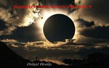
It was drawn by an English artist and I chose it because it spoke to me about my life dealing with personality disorders...
It was drawn by an English artist and I chose it because it spoke to me about my life dealing with personality disorders...
DonP
Guest
I like the picture, but I have problems with the text. The top text is for me the wrong colour - maybe gold, or an off-silver. And it shouldn't be Italicised. And bigger.
The bottom words just look kind of dropped there. I'd like to see them just below the horizon directly below the moon. The font is good.
One more thing. I think the moon needs to be either fully centred, or moved further right into a sort of rule-of-thirds position.
Just my two pen'orth.
The bottom words just look kind of dropped there. I'd like to see them just below the horizon directly below the moon. The font is good.
One more thing. I think the moon needs to be either fully centred, or moved further right into a sort of rule-of-thirds position.
Just my two pen'orth.
I like the picture, but I have problems with the text. The top text is for me the wrong colour - maybe gold, or an off-silver. And it shouldn't be Italicised. And bigger.
The bottom words just look kind of dropped there. I'd like to see them just below the horizon directly below the moon. The font is good.
One more thing. I think the moon needs to be either fully centred, or moved further right into a sort of rule-of-thirds position.
Just my two pen'orth.
Thanks, Man...I appreciate your input.
I did the lettering/title myself, and I am no artist, as you can tell.
"Distant Worlds" was dropped there so it would not obscure the shoreline.
What does this cover make you expect to hear???
The story behind the image - as a kid, I didn't fit in with anyone. I had speech and coordination issues that made me a convenient target of bullies.
Kids would ask me, "Hey Freak, what planet are you from?" and that stuck with me.
In this image, I am standing at the edge of my world, in the shadow of the normal people's world, wondering what its like to live in the sunshine....
Kids would ask me, "Hey Freak, what planet are you from?" and that stuck with me.
In this image, I am standing at the edge of my world, in the shadow of the normal people's world, wondering what its like to live in the sunshine....
Love the cover art! Agree with the Red text being wrong...it's not pleasing to the eye...
By the way I am a huge fan of album cover art! I have at least 4 books on the subject and that's one thing that made me dislike CD's...
I really struggled with the lettering color. I finally settled on the red, because i couldn't find anything I liked more.
Suggestions???
RVA
Ambassador
The cover only tells me that it will not be hard music. Beyond that, it makes me skeptical. It could be
- religious
- experimental instrumental stuff
- folk
The first 2 are compounded by the words "distant worlds"
It does not make me expect blues or rock.
I want to ask what the theme is, but posting it here will ruin the objectivity of the thread.
- religious
- experimental instrumental stuff
- folk
The first 2 are compounded by the words "distant worlds"
It does not make me expect blues or rock.
I want to ask what the theme is, but posting it here will ruin the objectivity of the thread.
Last edited:
The cover only tells me that it will not be hard musicc. Beyond that, it makes me skeptical. It could be
- religious
- experimental instrumental stuff
- folk
The first 2 are compounded by the words "distant worlds"
It does not make me expect blues or rock.
I want to ask what the theme is, but posting it here will ruin the objectivity of the thread.
You are wise indeed...
I may not use it just because of the perceptions you mentioned. Could you imagine popping this in and hearing a high gain version of "man of constant sorrow? "
I suppose that in this case, it would be more appropriate to design a cover more reflective of the material....but I never seem to put two and two together....
RVA
Ambassador
You are wise indeed...
I may not use it just because of the perceptions you mentioned. Could you imagine popping this in and hearing a high gain version of "man of constant sorrow? "
I suppose that in this case, it would be more appropriate to design a cover more reflective of the material....but I never seem to put two and two together....
That is beautiful art. Marketing is a tough thing. Others may not agree with my assessment. Focus groups/market testing, which is really what you are doing, is intended to pick among the varied viewpoints so that you target an audience that is most appropriate for your overall business goals. It has little to do with art, vision or expression.
Then again, insane ramblings and angry tones from an ADHD person is not much of a title...
That is beautiful art. Marketing is a tough thing. Others may not agree with my assessment. Focus groups/market testing, which is really what you are doing, is intended to pick among the varied viewpoints so that you target an audience that is most appropriate for your overall business goals. It has little to do with art, vision or expression.
I agree with you.
RVA
Ambassador
You are way to hard on yourself. I have never met you in person, but my impression of you here is a smart, sensitive and thoughtful person who is very self aware. There are not a lot of people who can lay claim to these admirable attributes. I bet your songs also reflect these attributes.Then again, insane ramblings and angry tones from an ADHD person is not much of a title...
Live in the present. The rest is a Distant World (see what I did there?).
RVA
Ambassador
See that. Robert needs more opinions. After all, others taken issue with my opinion quite often!!!I like the cover!
I appreciate everyone's input. I'm have been undecided on this since 2012 and I'm very open to suggestions
I guess I'm a little unsure of just what box I fit into. I've always been a back-up man and I dislike my lead vocals....I only sing because I don't have anyone else to do it.


